What does an Insight Analyst do?
Whilst I had not previously looked at the specific role of Insight Analyst, I had previously applied for Data Analyst and Business Analyst roles and I think they are all kind of similar, much like Web Developer, Developer, Software Developer, Software Engineer, Frontend Engineer, Backend Engineer, etc are all just different titles for what is basically the same underlying skillset.
The role of Insight Analyst is to tell the hidden stories that sit behind robust data. They are responsible for turning raw data into actionable insights that drive strategic decision-making.
Insurance Data
The role I applied for was with a company that help insurance companies benchmark their products, pricing and customer satisfaction. Some of this is regulatory required information, but some of it is about finding competitive advantages. The primary purpose is to transform data into compelling narratives and recommendations giving the customers of this company a competitive edge in Insurance, Financial Services and beyond.
Story Telling & Relationship Building
One thing I think a lot of people trying to break into the Data centric roles don’t always realise is that, certainly at the Analyst level, the role is more about your ability to build relationships and use data to tell stories more than just finding cool ways to make data look nice.
The role needs you to be able to identify and analyse interesting data, bring it to life, and leverage industry knowledge to provide context to what the numbers show.
What you will do as an Insight Analyst
You need to provide high-quality insights that help clients see the world through the eyes of a consumer and help those clients improve their services. The data can be complex, you need to simplify that complexity into engaging content that can be easily communicated across all levels and specialisms.
The interview process
There was basically two rounds of interviews for this role. The first round was quite informal, and actually, really refreshing. It was an informal chat with the line manager. A walk through your CV and why you might be interested in this role. The line manager described the role, the team and how performance is measured. There was plenty of opportunities to ask questions and although it was a relatively short video meeting, it was very relaxed and not at all like a typical developer type interview, where the aim seems to be to find what you don’t know rather than what you do know, if that makes sense.

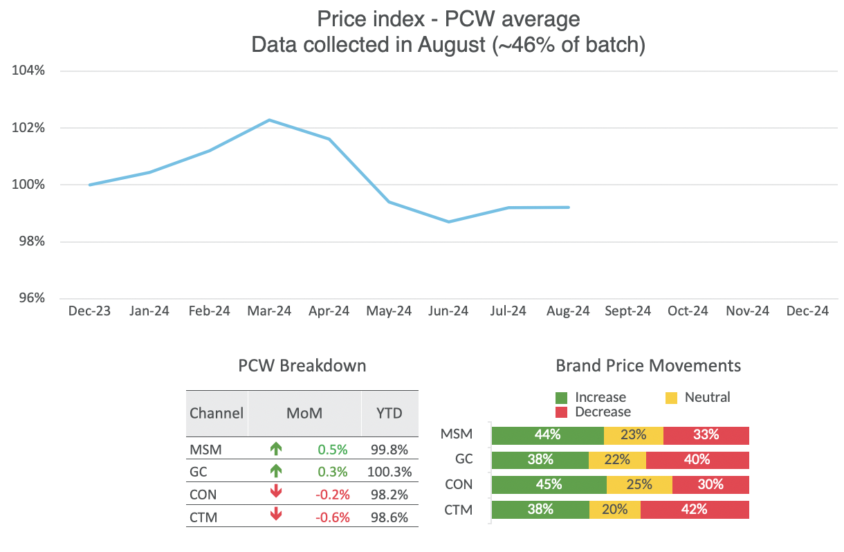
The next stage was a two part process, first, you were sent a presentation that showed some data but did not have any insights. So basically you were sent a bunch of graphs, the challenge was to evaluate that data and describe the insights you could extract from said data. The second part of this was to give a presentation to what might become your peers if you were successful. The purpose of the presentation was to treat the others as your client (a customer of this company) and describe to them what the data was saying and what your recommendations are.
Adding insights to someone else’s charts
So the idea was to review the charts and try to build a narrative around those charts. Ultimately, you would need to present that data to your potential line manager and peers. We start with Market Headlines:
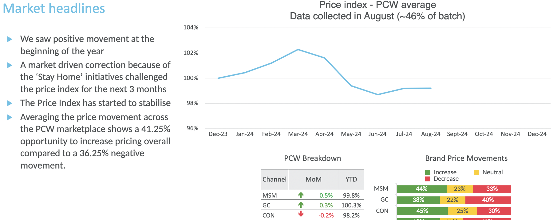
I must admit I was not expecting this, I thought I would be sent a bunch of data, perhaps excel, perhaps .csv, perhaps SQL. I thought the challenge would be to build up a slide deck from scratch. Like many others that have not done this role before, I expected it to be more about making those charts rather than telling the story.
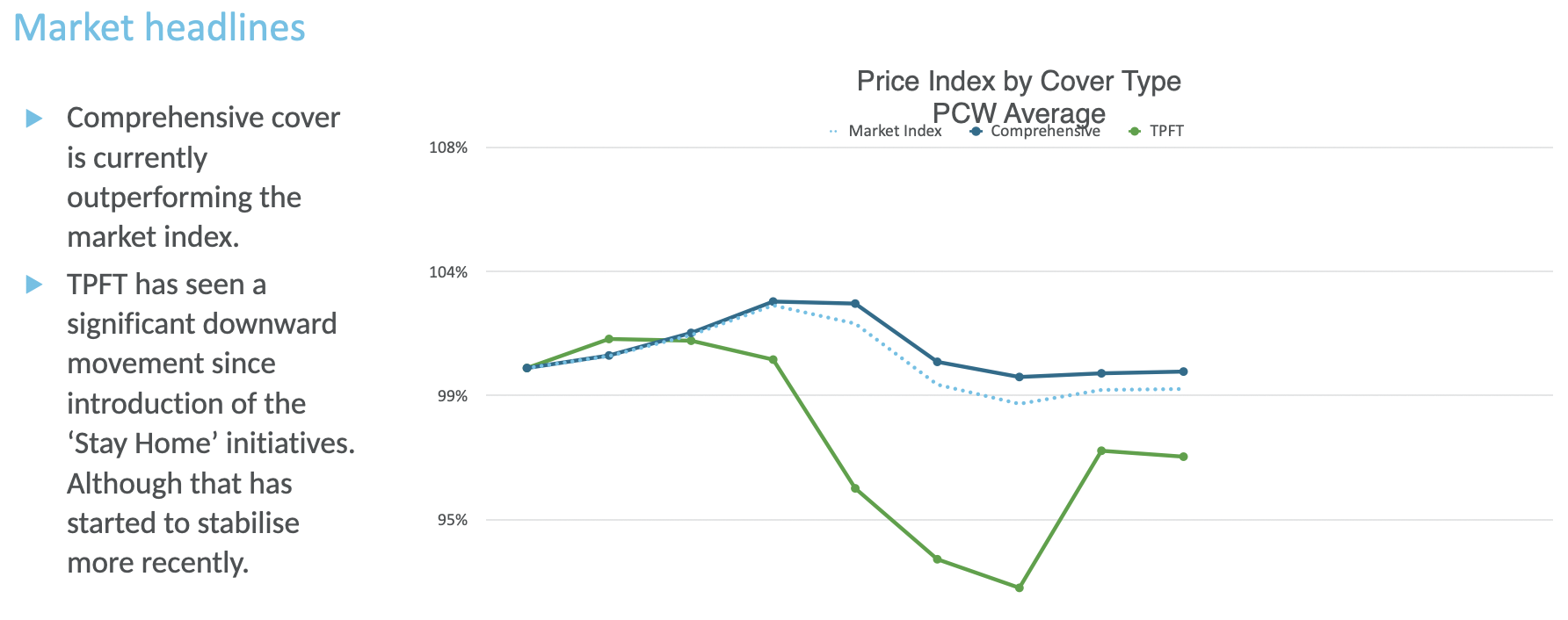
In fact, the take home assessment was more true to what the company would expect from you, they’ve already designed the slide deck, they’ve ‘conditioned’ the clients on what to expect from a slide deck, the process of collecting the data sits somewhere else and the production of the charts is automated, your role is to understand that data and help the client understand the story behind that data.
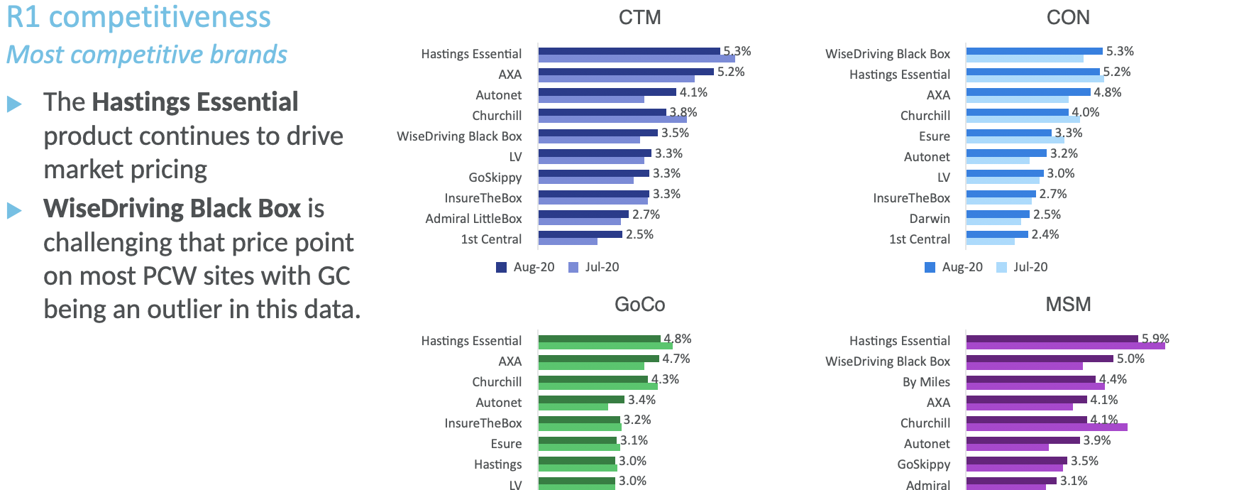
The slide deck came with some descriptions of what things like R1 Competitiveness meant, so I wasn’t completely in the dark. I think someone with a background in insurance would understand this term, but for me, I was glad to have the description as well. Essentially R1 Competitiveness is a measure of how your product or brand did against the product/brand that was the most successful for this segment of the market on that particular week in history.
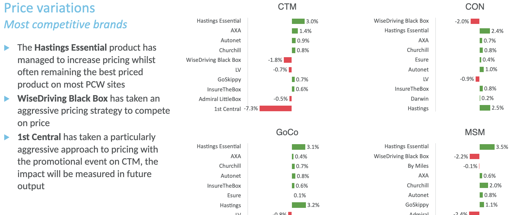
I mentioned that the purpose of the role was not to come up with data visualisations, well, that isn’t completely true, however, they don’t want clients to receive different visualisations for the same data, but that doesn’t mean that they never consider alternative data visualisations.
Instead, once a quarter or so, the company gets the analysts together and you get to propose and perhaps argue for, different visualisations, you get to try new ways of examining the data and new ways of presenting that data.
This allows the data visualisations to stay fresh, it allows the team to try out any new ways of evaluating and presenting data and it allows the team to agree on how the slide deck should look going forward. New data pipelines are built, if required, and all of the clients see that new way of presenting data at the same time.
Executive Summary
Probably the most important slide as it is likely where some of the potential audience will focus. This should be used to highlight the most important insights:
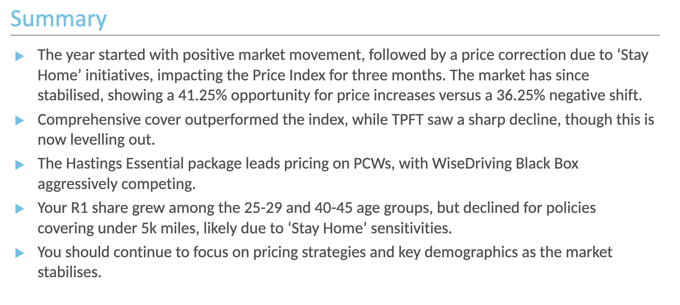
Most presentations have two audiences, the people that are interested in everything and the people that just need the headlines with the option of being able to dig deeper if they need to.
Improvements?
The slide deck finished with a slide that would allow you to share your thoughts and propose alternative visualisations, I didn’t find that bit especially useful as I think alternative visualisations come from have better access to the underlying data. Something like Exploratory Data Analysis can help you understand your data better which may lead to new and interesting visualisations.
